Related Articles
- Navigating the Talent Labyrinth: How Emotional Intelligence Is Shaping New Hiring Practices in Unseen Markets
- Behind the Scenes: How Automating HR Processes Is Redefining the Future of Recruitment and Job-Seeking Strategies
- Beneath the Surface: Unveiling the Surprising Role of Environmental Sustainability in Shaping Future Careers
- Exploring the Quirky Side of Remote Work: How Hobbies Are Fueling Professional Success in Unexpected Ways
- How the Remote Revolution is Inspiring Unlikely Friendships Across Continents: A Study of Global Connectedness
- The Unforeseen Bond: How Virtual Coworking Spaces Foster Unexpected Connections Amidst Remote Work
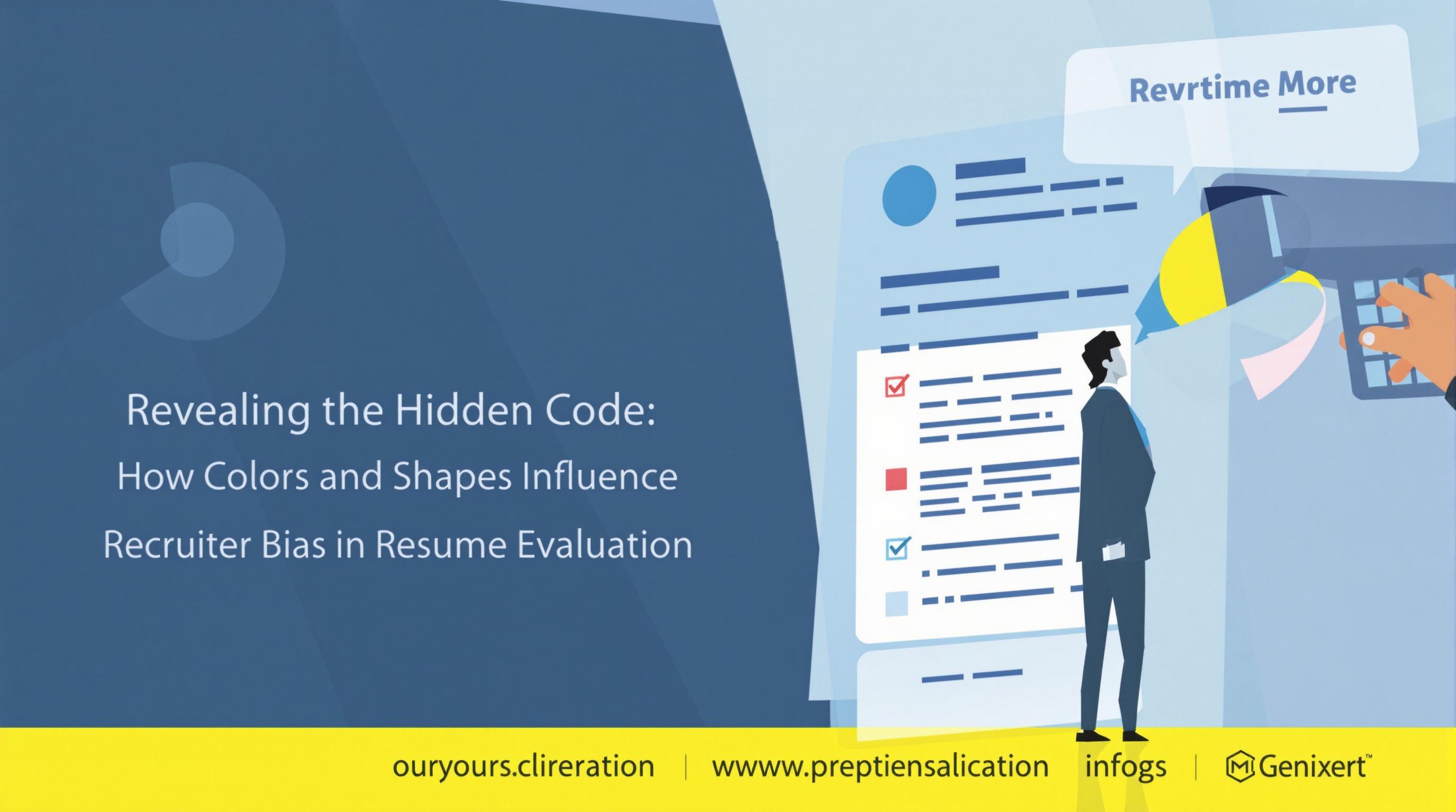
Revealing the Hidden Code: How Colors and Shapes Influence Recruiter Bias in Resume Evaluation
Revealing the Hidden Code: How Colors and Shapes Influence Recruiter Bias in Resume Evaluation
Recruiter bias is an often understated phenomenon that can sneak into resume evaluations, influenced heavily by the colors and shapes we encounter. This article delves into the hidden code of colors and shapes, revealing how they can significantly sway a recruiter's perception and decisions, often without them even realizing it.
Understanding Bias in Resume Evaluation
Bias isn't just a term tossed around in HR circles; it's a well-documented reality that impacts hiring decisions across the board. According to a study published in the Journal of Applied Psychology, the initial impressions formed during resume evaluations can disproportionately affect information processing later in the evaluation. For the aspiring job seeker, this means that every detail—right down to the color of the font—can play a surprising role.
The Psychological Effect of Colors
Color is more than mere aesthetics; it’s a psychological trigger that can evoke emotions and reactions. Research conducted by ColorPsychology.org discovered that different colors can elicit particular feelings: for example, blue is associated with trust and reliability, while red evokes strong emotions and urgency.
The Power of Perception
Let’s consider an example: a candidate submits a resume with a bright yellow header. While the color may be intended to convey optimism, it can also be perceived as ‘loud’ and ‘unprofessional’ by the recruiter. Conversely, a dark blue header could emanate professionalism and reliability, potentially giving the candidate an edge in a competitive job market.
Case Study: Visual Influences on Recruiting
A notable case study conducted by the University of Toronto looked at over 500 resumes evaluated by a group of recruiters. The study showed that resumes with blue and gray hues had a 15% higher chance of being shortlisted compared to those that used brighter, more vibrant colors. This highlights just how much visual appeal can tilt the scales in favor of one candidate over another.
Shapes and Their Significance
Shapes may not be the first factor that comes to mind when talking about resumes, but they play a crucial role in our visual perception. Shapes can shape feelings, too—literally! Circular shapes can denote unity and community, while angular shapes might suggest stability and strength. Consider the shapes used in logo design: which do you remember more? The elegant curves of Starbucks or the sharp lines of a typical tech brand?
The Resume Layout Dilemma
Imagine a hiring manager scrolling through a pixelated rainbow of resumes. One candidate opts for rounded corners on their resume layout, while another chooses a sharp rectangular format with jagged edges. According to Harvard Business Review, candidates who utilize rounded designs are perceived as more approachable and friendly, while sharp-angle designs might be misinterpreted as distant or overly aggressive. It’s all about the message your layout sends!
Colors and Shapes in Practice: Tips for Candidates
So, what’s a savvy job seeker to do? Here are some strategies for incorporating the right colors and shapes into your resume:
- Stick to a Palette: Limit your color choices to two or three that complement each other. Soft blues and greens are generally safe choices.
- Embrace Negative Space: Don't clutter your resume. Give your shape some breathing room; it creates a more positive impression.
- Experiment with Rounded Edges: Consider softening the corners of your resume, making it appear more user-friendly.
Real-World Implications of Recruiter Bias
The stakes in hiring are incredibly high. A 2019 report from the Burning Glass Technologies showed that 60% of job seekers in the U.S. face bias based on their names or perceived backgrounds. While it’s crucial to address these biases, many recruiters overlook subtle but impactful elements like colors and shapes in their evaluation process.
Bringing Change to the Recruitment Process
Organizations are increasingly recognizing the need for bias training, but few delve into the visually-driven aspects of bias that can arise from resumes. Companies like Glassdoor advocate for more structured approaches to resume evaluation. Their research indicates that providing tools such as standardized resume templates can help mitigate bias by outlining expectations and limiting candidates' choices, thus equalizing the playing field.
A Conversation on Color and Shape
Let’s have a moment of candor here: as a recruiter, how much time do you really spend analyzing the aesthetics of a resume? At a fundamental level, we all want to find the best candidate, right? But if colors and shapes trigger subconscious preferences, could you inadvertently pass over a highly qualified candidate simply because their resume had a splash of color you disliked?
Conclusion: Embracing an Inclusive Approach
As we navigate the complex web of hiring practices, acknowledging the influence of colors and shapes should be part of the conversation around inclusivity. By broadening our understanding of visual communication, we can create environments that foster equitable opportunities for candidates from all backgrounds.
For applicants, knowing the impact of design elements can be empowering. Every decision, from color choice to layout, has the potential to shape a narrative that resonates with recruiters. So, the next time you're crafting your resume, remember: it's not just about what you say, but how you present it!
In summary, understanding the psychological impact of colors and shapes on recruiter bias can enhance not only the candidate's prospects but also contribute to fairer hiring processes. Whether you're a seasoned recruiter or a fresh grad, educating yourself on these visual subtleties can lead to meaningful change in the job application landscape—and who knows? Your resume just might become a conversation starter over coffee!
Read More